advertisement
The People Behind Windows 11: Using Psychology, Familiarity And Inspiration To Create Widgets
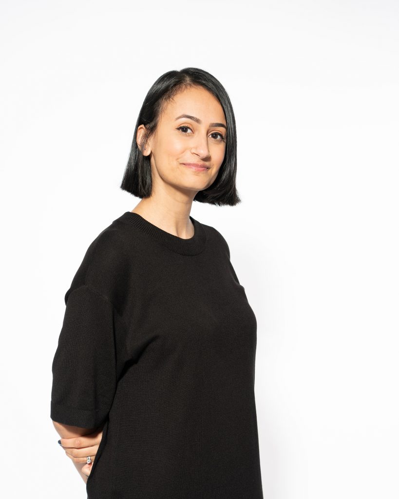
Before moving to Seattle with her husband seven years ago, Priya Chauhan had never worked in digital design. She came…

Before moving to Seattle with her husband seven years ago, Priya Chauhan had never worked in digital design. She came from the print publishing world, where she worked on children’s books, coffee table books, travel guides, catalogs, window display posters, chocolate and biscuit tins and all kinds of seasonal marketing.
If you lived in London at that time, you probably saw her designs throughout the city and in magazines. But once she started working for Microsoft five years ago, she entered a fast-moving space where she could make global impact. (The first time she used a PC or Windows was her first day at the company. Now she only uses PCs and Windows.) Chauhan started on services and store fronts, then Microsoft Rewards. Then she moved to the Windows team. As a designer working on a new, signature feature for Windows 11 – widgets – she measured success by one thing: how it could make people happy.
She wanted something that would give people a peek into what’s most important to them. Widgets, which may be familiar to anyone who’s used a smartphone or tablet, offer a personalized pop-up collection of information on weather, sports scores and other bits of information.
advertisement
“You don’t have to switch between devices and break your workflow,” says Chauhan, whose own work last year was paused when she had her first child. “With one swipe you can access the widget board, which gives you just a quick glance to what you need to know. Like, when is my next meeting? Is it going to rain when I go for my run? The quick kind of information you need without stopping to check your phone and then come back.”
She drove the user interface of the widget experience, its visual framework that includes color, typography and layouts. Chauhan drew inspiration from a variety of sources – everything from the big, bold typefaces on coffee packets to the soft color palette animations of weather apps. She gathered images that sparked her creativity in digital mood boards. With her background in graphic design, she’s always looking at core foundations and elements: layout, negative space color and hierarchy.
And with widgets, she and her team weren’t going to reinvent the wheel.
“We’re just trying to bring it in line with what people are used to using,” Chauhan says. “What we’ve tried to do with Windows 11 is make it not just about work, but also about play, home, family and entertainment. I think people probably are going to be surprised. I think it’s just a fresh outlook for us and it’s really going to resonate with people.”
advertisement
Dorothy Feng also worked on widgets – as a user experience (UX) designer who incorporated her background in psychology in improving the experience. As a student at Duke University, she originally thought she would end up in clinical psychology or research. But she had always been interested in design, teaching herself Photoshop and creating freelance illustrations in her free time.
Then, in her sophomore year, she joined a tech group at the school called Hack Duke, which focused on organizing hackathons. She became the group’s director of design, which entailed marketing assets such as branding and website design. That led to more exposure to people in the tech space and consulting for tech incubation start-ups, which is how she began to do UX design.
Feng also took a computer science class. She did well and thought she was going to be a software engineer. But she met someone who interned as a product designer, who introduced Feng to the intersection of design and tech – a combination that appealed immensely to her. It would change the course of her life, as she had never thought that there was a way to combine art/design with technology.
advertisement

“It was a huge shift in my career path,” says Feng, who interned for Microsoft before starting a full-time position in 2018. “I majored in psychology and computer science and at that time, I did not see an intersection. Someone told me those are two completely opposite things; how would I make that work? But, I’m interested in both. When I studied psychology, I was very deeply rooted in writing and focused on research, but on a higher level that has helped me approach design in a very methodical way.”
But the artsy side of Feng draws inspiration from nature, its simplicity and complexities, as well as daily life, appreciating what she sees around her when she’s walking in her neighborhood. She even gets ideas from the grocery store, through how aisles are laid out and the checkout experience.
“I think people probably are going to be surprised.”
Working at Microsoft, she used that knowledge of knowing how things are built to create rapport with developers, but she also had a solid understanding of design. “Throughout my journey as a designer, I leaned quite heavily on my background in psychology.
I’ve written a lot of psychological research papers and I’m really familiar with synthesizing different areas of research,” she says. “That gave me a really deep understanding of the need to incorporate user feedback and research into my work. I couldn’t design anything without consulting research.”
Feng says user feedback shaped the experience and validated the need for the space widgets occupy, “where people can see everything that they care about, that’s easy to access and can fully customize.”