advertisement
Fitbit Sense Review: Ambitious To A Fault
There are a lot of things the Fitbit Sense does that the Apple Watch can’t. Fitbit’s latest smartwatch can track…
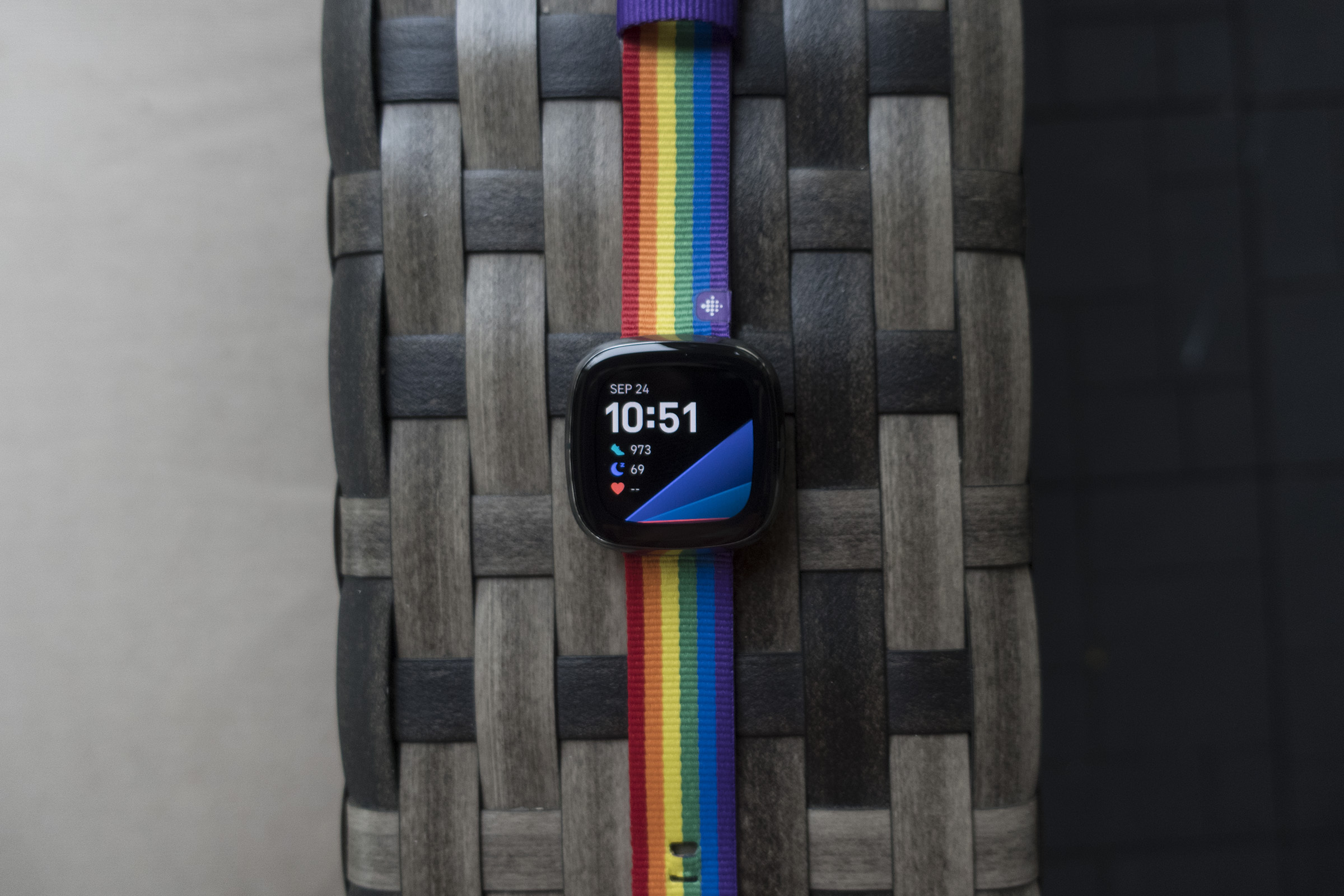
There are a lot of things the Fitbit Sense does that the Apple Watch can’t. Fitbit’s latest smartwatch can track your stress level and help you calm down. It records your nightly skin temperature to help predict if an illness is coming on. It lets you choose between Alexa and Google Assistant (or at least it will soon). And the battery lasts for days and days.
 MICHAEL SIMON/IDG
But while Fitbit has done an admirable job in building a genuinely different smartwatch—and in some ways better than Apple’s latest wearables—the Sense ultimately tries too hard to be an Apple Watch alternative. Where Apple has slowly added features to its watch to keep things simple, Fitbit’s quest to leapfrog Apple has given the Sense too many things to do. Rather than embracing the simplicity of the Versa and distilling the effortlessness of its sleep detection into a watch that adapts to the user, the Sense adds enough complexity to make the whole experience more frictional that it should be.
advertisement
Fitbit doesn’t need to go back to the drawing board, but the Sense isn’t the next-gen smartwatch Fitbit needs, at least not yet.
A familiar, refined design
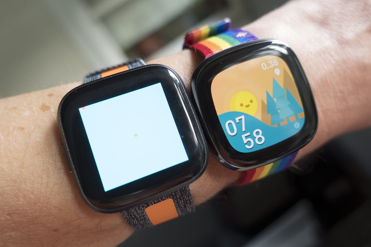
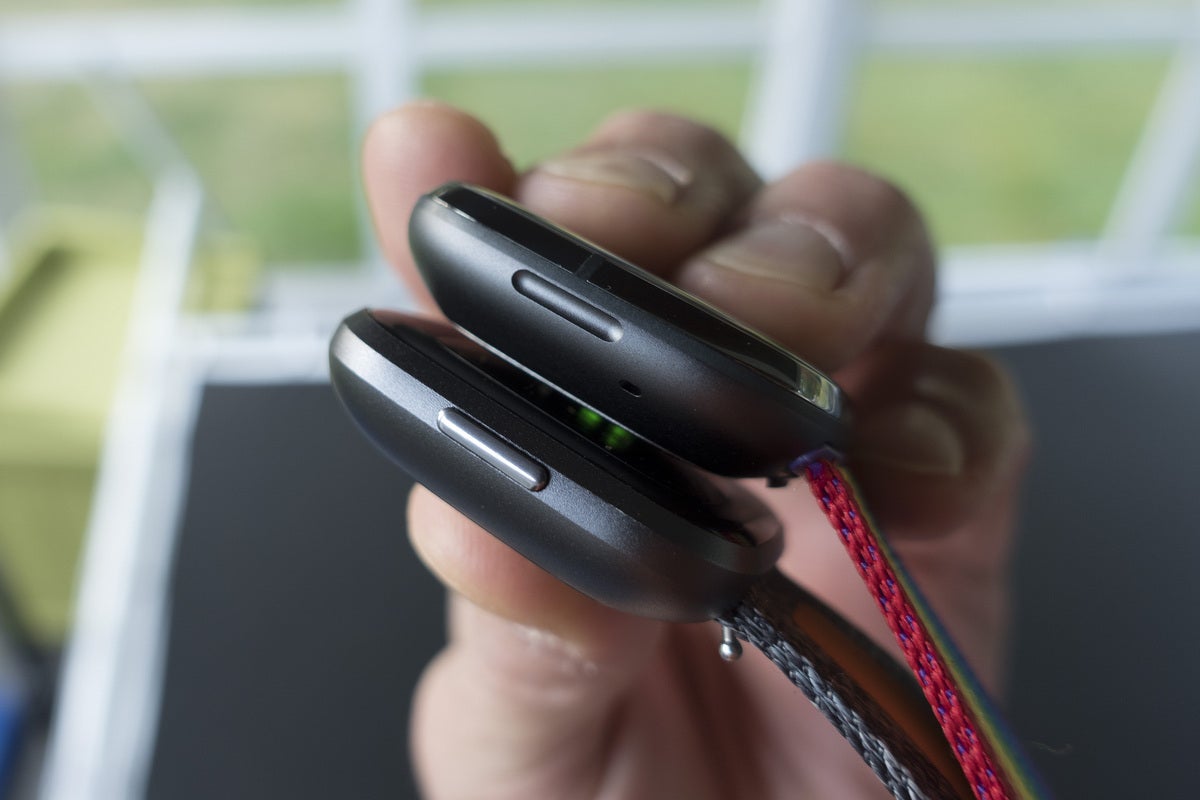
If you’ve been paying attention to Fitbit over the past few years, the Sense will look very familiar. It’s not quite a carbon copy of the Versa, but it’s very similar, with a design that’s a bit more rounded but still square. It’s a smidge bigger than the Versa 2 but identical to the Versa 3’s dimensions (40.48 x 40.48 x 12.35mm). The Versa 2’s mechanical button has been replaced by an inductive one, which gives the Sense a sleek, seamless aesthetic.
 MICHAEL SIMON/IDG
advertisement
The bands look very much like the ones on the Versa 2 as well, but you won’t be able to swap your old Versa bands onto the Sense. That’s due to the new quick-release mechanism that’s light-years easier over the clunky pin method on the previous Versas. It’s very much like Apple’s method on the Apple Watch, but even easier, as there’s no sliding. The straps just snap in and out. If you’ve collected a bunch of Versa bands, buying a set of new ones isn’t ideal, but for most it is an acceptable tradeoff.
The Sense’s OLED screen jumps to 1.58 inches from the Versa 2’s 1.39 inches. And it has rounded corners now just like the Apple Watch, which helps the Sense’s display blend into its bezels. There’s still a bit more space between the screen and the edges than I like, but Fitbit OS’s dark UI mostly makes the edges of the screen invisible to the naked eye.
 MICHAEL SIMON/IDG
advertisement
In previous Fitbit reviews, I gripe a lot about the continually changing and finicky chargers, but the Sense finally gets it right. It’s magnetic like the Inspire, but strong enough so it won’t shift loose, attaching with a firm snap. And in a first for Fitbit, the Sense supports fast charging, so you won’t have to keep it attached to a charger for very long. In 12 minutes (Fitbit’s recommended power-up time), I went from 4 per cent to 27 per cent, more than enough to get me through a full day of use.
Sensors and sensibilities
The Sense looks nice, but the design isn’t the thing that’ll convince most people to buy it. You get the usual metrics on which Fitbit has built its reputation, including best-in-class sleep tracking and Active Zone Minutes, which automatically record and alert you to intense exercise even if you’re not tracking a workout.
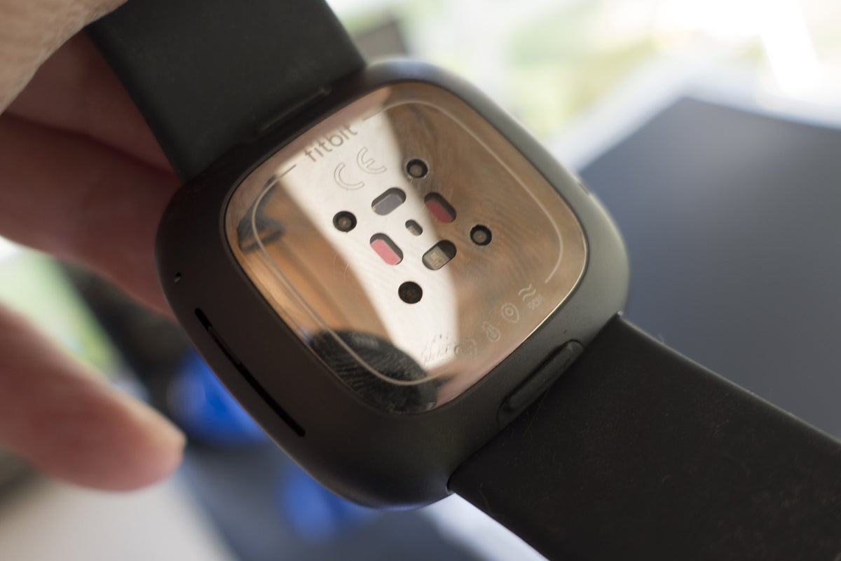
But inside its small frame you’ll also find an array of new sensors the likes of which you won’t find in another consumer smartwatch:
- PurePulse 2.0 optical heart-rate sensor
- Sp02 blood-oxygen sensor
- EDA sensor (electrodermal activity to check stress)
- ECG app
- Skin-temperature sensor
That’s an undoubtedly impressive array of abilities. While Fitbit isn’t reinventing the wheel with the Sense—all of these sensors are available in some way, shape, or form on the smart wearables—it has absolutely raised the bar for what a smartwatch can do.
 MICHAEL SIMON/IDG
I wasn’t able to test the ECG app since it only recently received regulatory approval in the US Fitbit says the feature should roll out to Sense owners in October. I’ll update this review with results and impressions when it arrives.
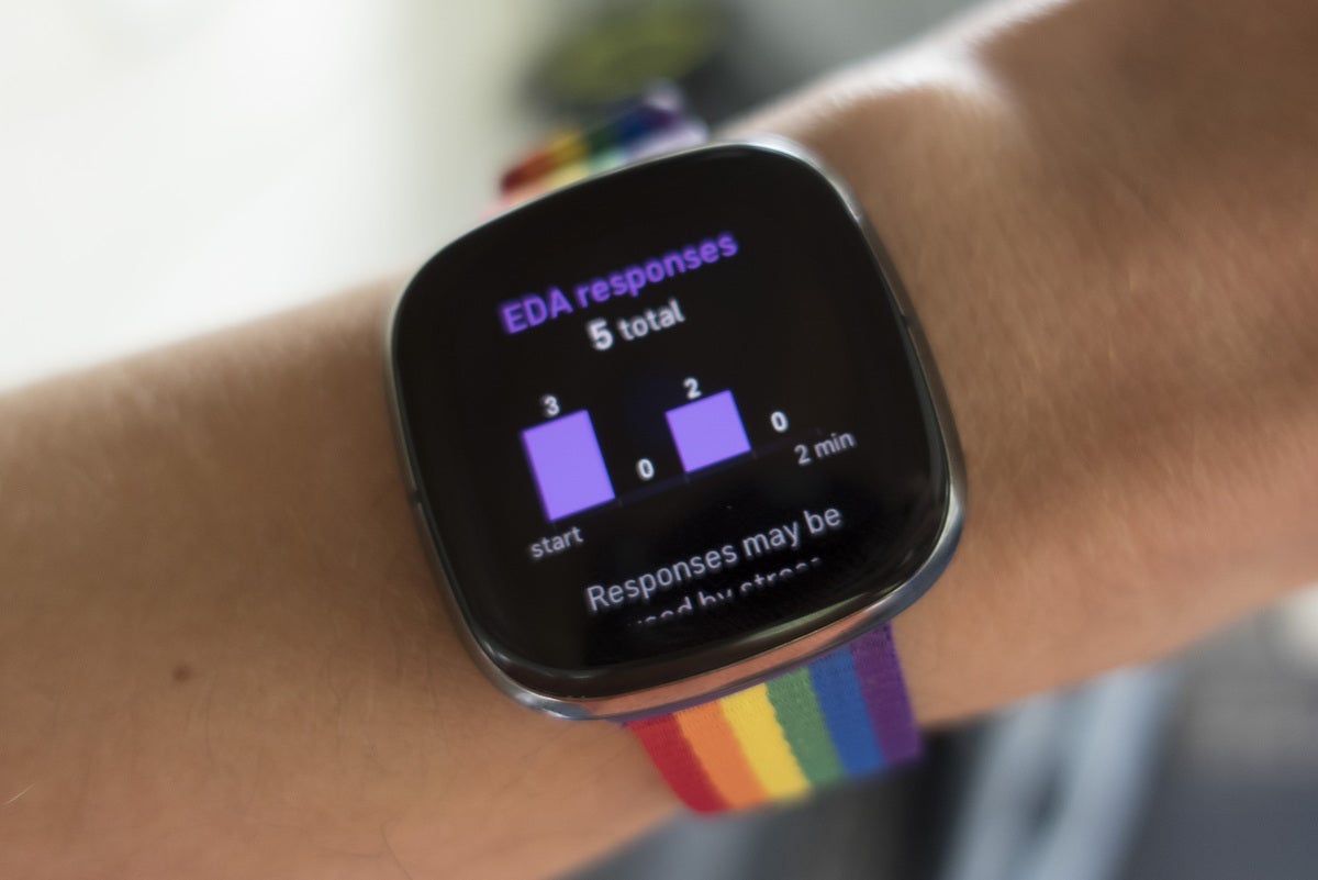
The rest of the sensors all do what they’re supposed to do, albeit with a bit of effort. The EDA sensor to check your stress level is the most labour-intensive, as you need to hold your palm over the face of the watch, making sure to press the metal sides, for at least 2 minutes to get a reading. You’ll get haptic feedback at the start and finish, but the somewhat clunky and lengthy implementation feels like something that would quickly end up on Apple’s cutting-room floor.
The way it works is two-fold. First, there’s a stress management score that combines your heart-rate, general fatigue, and sleep data to generate a number ranging from 1 to 100, with 100 being completely stress-free. You don’t have to use the sensor to generate a daily score, but if you do, you’ll contribute to your mindfulness, which should naturally lower your overall score.
 MICHAEL SIMON/IDG
Then, after each test, you’ll be alerted to any EDA responses (changes to the sweat levels on your skin) as well as where in the scan they were recorded. Premium subscribers can then head to the Mindfulness tab in the Dashboard to get a greater breakdown of their score, just one of the numerous ways Fitbit has placed a premium on subscribing to Premium. You get six months free with every Sense purchase, but after that subscribers will need to shell out $80 a year to get a chart tracking their session along with some sessions for managing stress.
There isn’t any insight as to what caused the triggered responses or the impact they had on your overall score. Still, the point of the exercise is to calm down and ultimately reach zero EDA responses, not unlike the point of the preinstalled Relax app. It all requires a good deal of effort and back-and-forth with the app, so my guess is anyone who’s actually able to do that probably doesn’t need it in the first place.
 MICHAEL SIMON/IDG
The skin temperature sensor also requires a bit of patience. Since it’s not designed to provide an on-demand reading, it takes three days to establish a baseline. From there, it will track your nightly trends so you can spot any alarming changes. At the moment, the metrics are tied to Premium, but Fitbit promises to open it up to non-paying customers “in the coming months,” so non-paying Sense users should still be able to access their graphs after their trial ends.
Like the EDA app, however, the skin-temp sensor seems like a work in progress, and I’m not convinced it is living up to its potential. I’m not sure it would actually help me diagnose an illness in real-time, and neither does Fitbit, since it’s not even alerting users to sudden changes in their trend lines. Fitbit plans on bringing skin temp tracking to the Versa family using those device’s existing sensors, so it stands to reason that it has bigger plans for the skin temp sensor on the Sense.
All of these sensors have an impact on battery life as well. Fitbit claims six-plus days of battery life for the Sense, but I didn’t get anywhere near that. Perhaps I used it a little more than the average person, but I have to charge it after 2.5 days when using the always-on display, and after 4.5 days with it off. Either way, it’s the worst battery life I’ve gotten in a Fitbit watch in a while.
Changes for the better and the worse
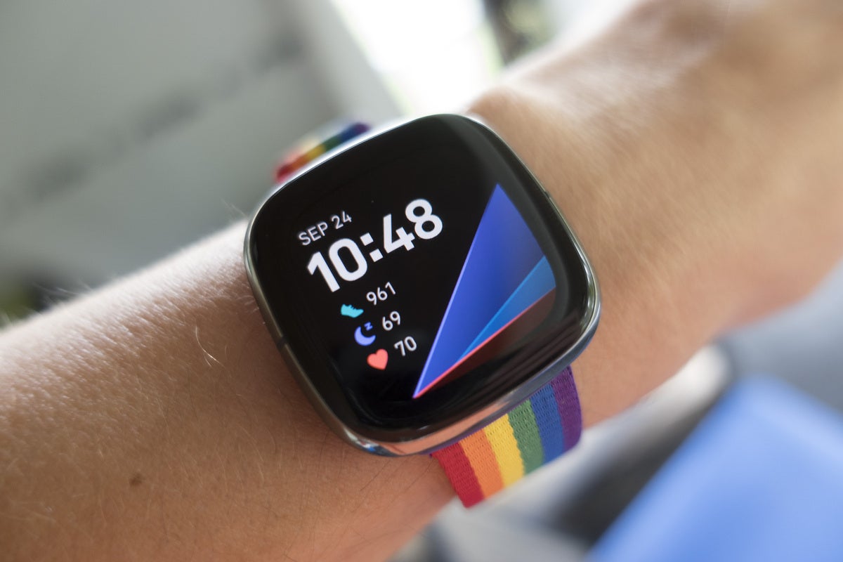
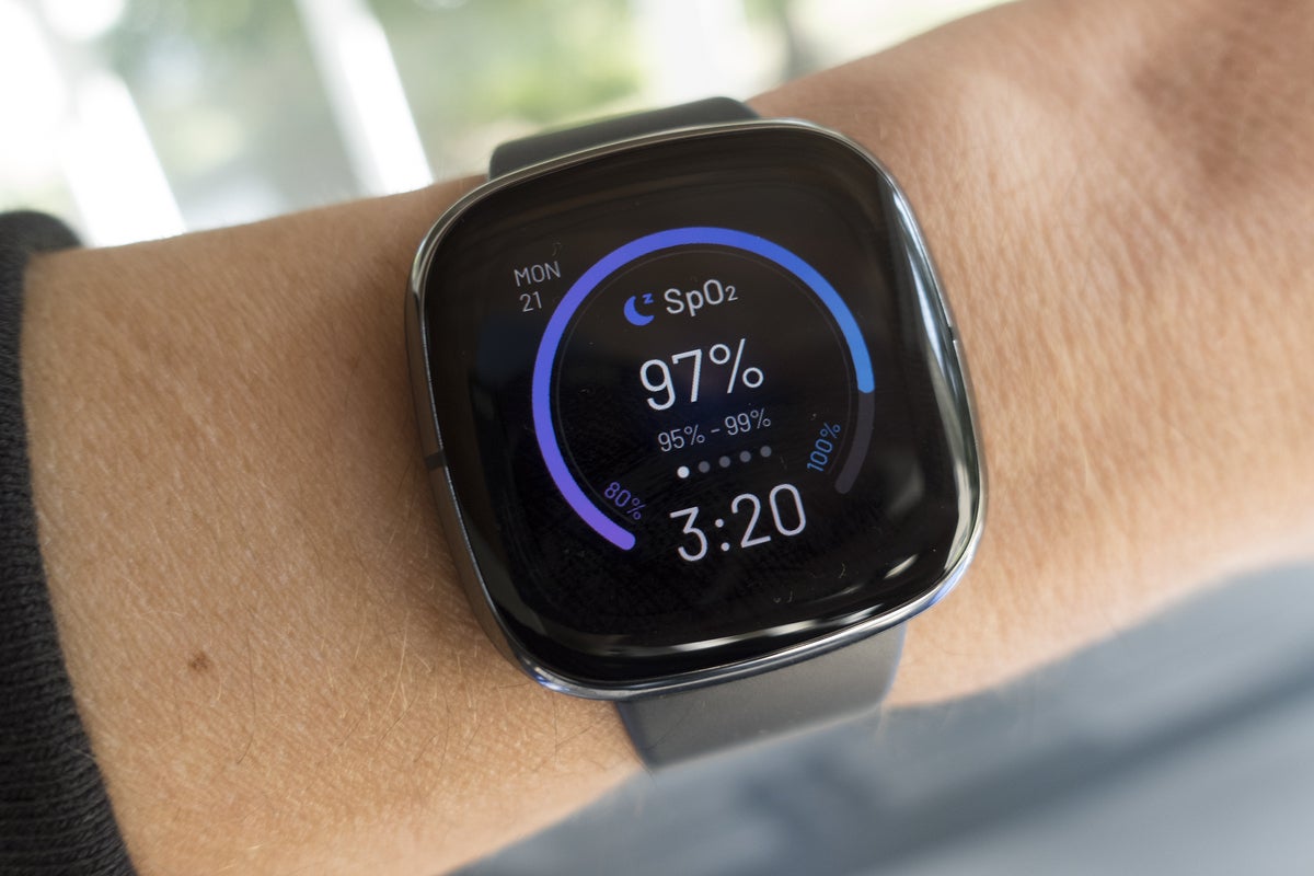
While the Sense’s new sensors are its main selling point, the star of the show is a feature that’s been around for a while. Fitbit is finally giving users a peek into the data collected by its Sp02 sensor via its new Signature clock face. While the timing conspicuously matches up with the launch of the Apple Watch Series 6, it’s a welcome addition to the Sense.
 MICHAEL SIMON/IDG
Like the rest of the Sense, it’s not quite as elegant as it could be. You can only view your reading overnight, and you need to have the Signature face active to record the results. Plus, it takes about an hour each morning before the number appears on the front. But it’s an excellent addition to Fitbit’s clock face collection, which has grown into an impressive catalogue.
The rest of the Fitbit OS 5.0 changes leave less to be desired. Fitbit OS is still more of a means than an end, and you won’t get the same stripped-down mobile OS experience that you get on the Apple Watch. Apps are very rudimentary, and it’s still not all that smart. The Alexa integration is okay and augmented by the inclusion of a speaker. However, it still struggles with specific tasks (such as Routines and song identification), and you need to say, “Ask Fitbit” when you want to see something on your watch. Perhaps Google Assistant will fix that, but I’ll have to wait to test it.
 MICHAEL SIMON/IDG
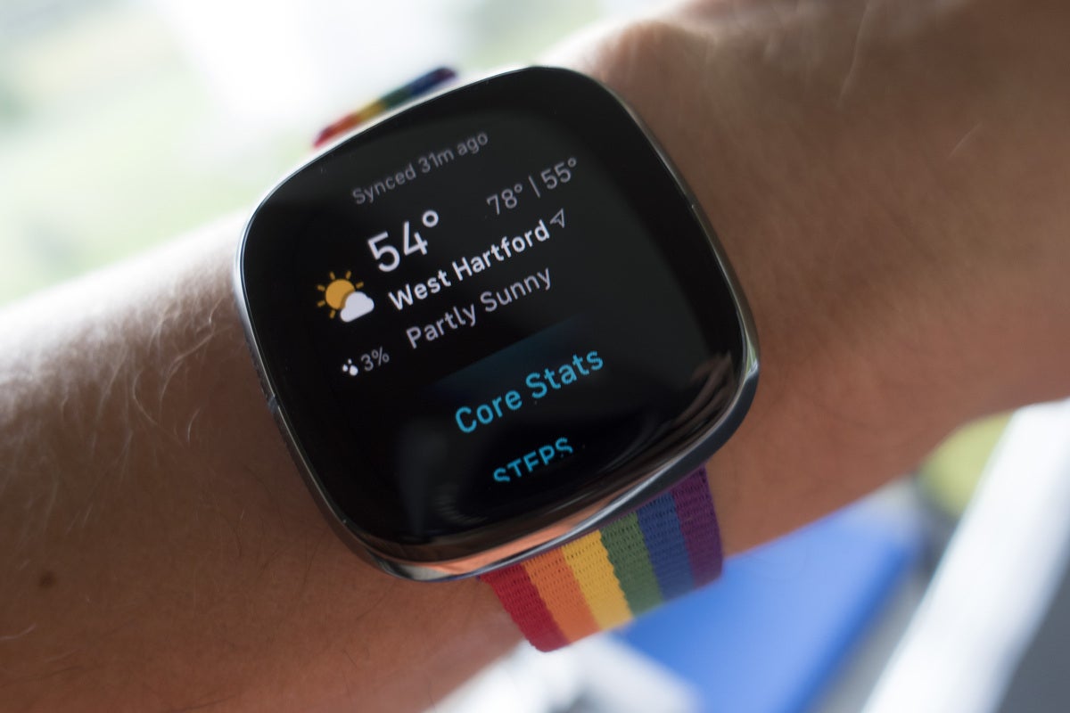
Fitbit has retooled things just enough where your muscle memory will need to be retrained, and most of it isn’t for the better. Quick settings are now off to the left of the screen, swiping up reveals the new widgets, which are shortcuts to Today (which is now a standalone app) and Fitbit’s other apps. Presumably developers will support widgets, but with a less-than-robust app library, that remains to be seen.
The button has changed as well and now functions solely as a power button rather than the back button. That tripped me up countless times, and if you’ve ever used a Fitbit watch (or any other wearable for that matter), you’ll need some serious brain retraining.
Should you buy a Fitbit Sense?
For $330 (Kshs 35,800), the Fitbit Sense falls nearly perfectly in between the $279 (Kshs 30,300) Apple Watch SE and $399 (Kshs 43,300) Apple Watch Series 6. However, it may as well be in no-man’s land. It might be able to do some things that the Apple Watch can’t, but it’s hard to justify choosing it over either of those watches. Even if you’ve sworn off Apple, the things the Sense does best—sleep tracking, exercise tracking, and battery life—can all be found on the Versa 3, which costs $100 (Kshs 10,850) less.
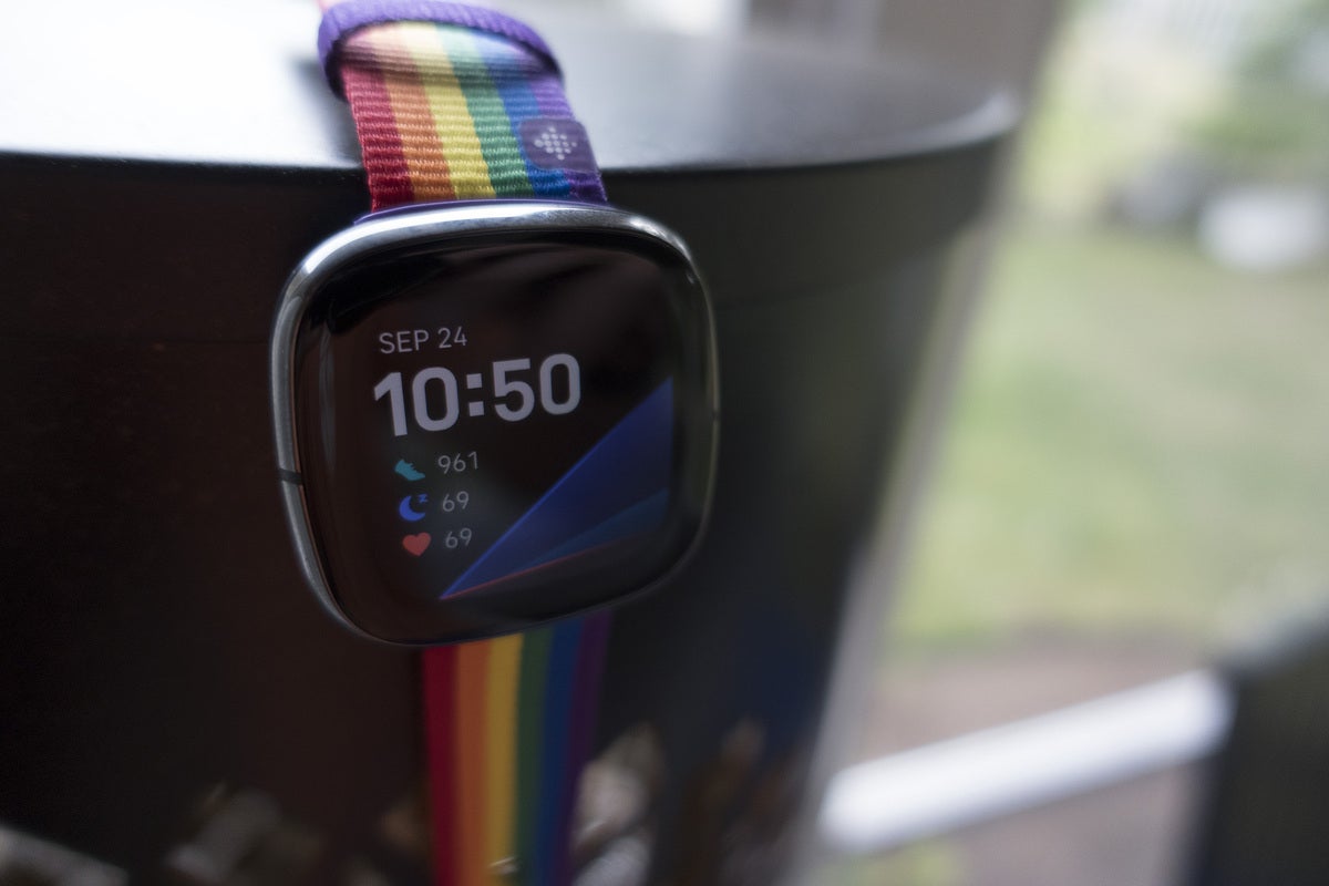
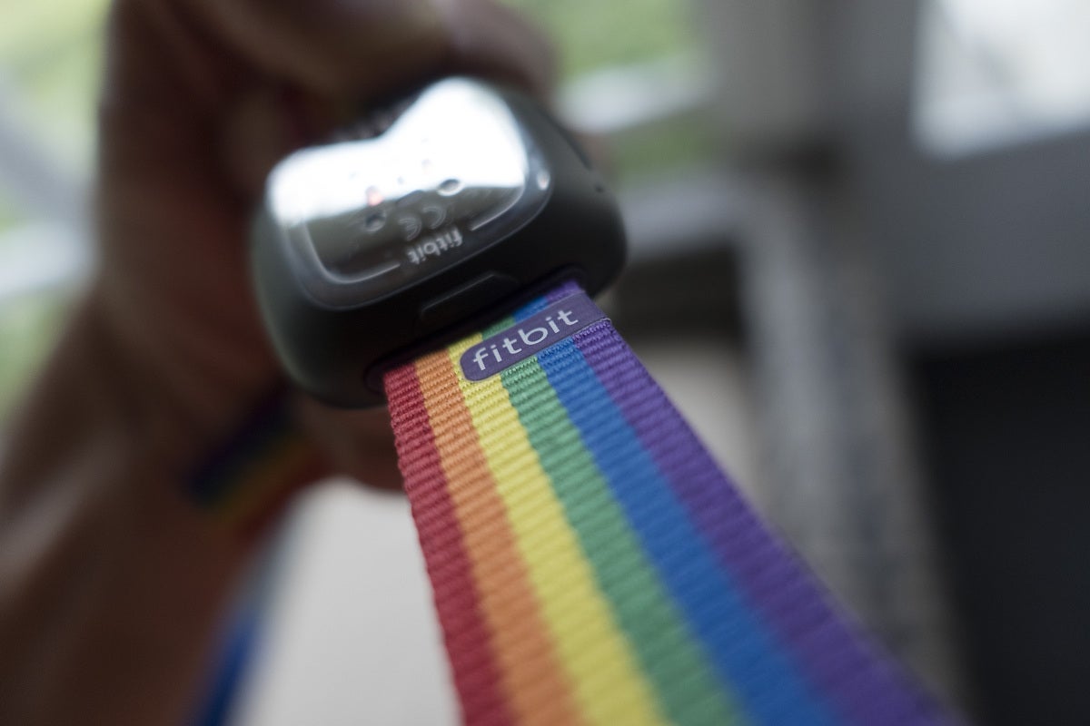 MICHAEL SIMON/IDGFitbit’s straps add colour and style to the relatively conservative Sense.
And it’s hard not to see the Apple Watch’s fall detection, Emergency SOS, always-on altimeter, and noise monitoring and not think Fitbit isn’t leaning into its strengths as much as it could be. The new sensors are exciting and might be extremely useful one day, but I’d rather see breakthroughs in the way the Sense senses the user.
The early Fitbits were remarkable for how little you needed to interact with them, but the Sense flips that script. By piling on sensors and features to seemingly compete with Apple, the Sense has added as much complexity as capability.