advertisement
HTC U11 review: A powerful Android phone that knows how to have fun
The annals of Android are littered with one-and-done gimmicks that were originally hailed as the next big thing. Indeed, from…

Industrial design as a liquid asset
If you’ve ever seen a U Ultra in the flesh, the U11 will be instantly familiar. From the front, it looks exactly the same as the U Ultra, with the off-center camera, pill-shaped home button/fingerprint sensor, and extra-large forehead and chin. A textured power button is still unfortunately positioned below the volume rocker.

 ADAM PATRICK MURRAY/IDG
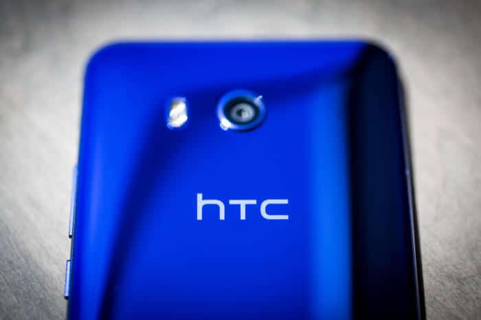
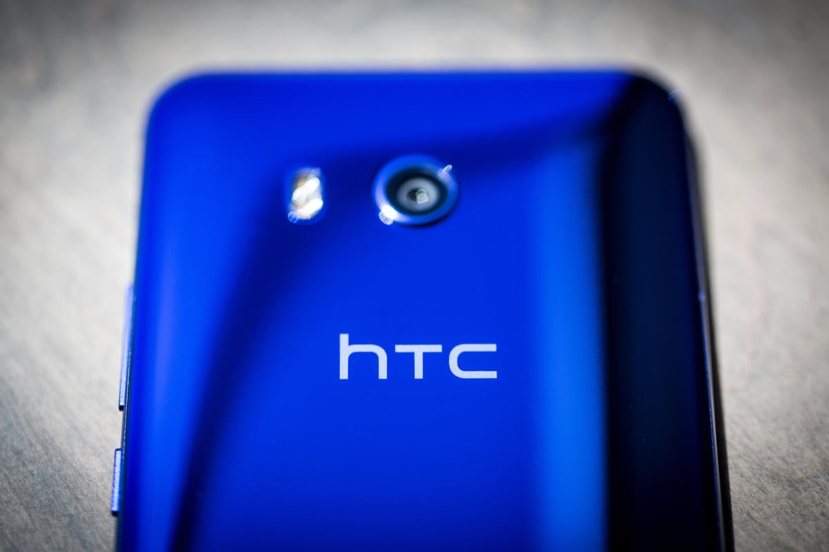
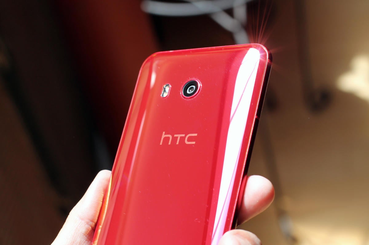
Flip it over, and the U11 is even more reminiscent of the U Ultra. The back plate uses the same “liquid” surface, which looks just as stunning as it does on the U11’s big brother, despite the persistence of the microphone hole, which mars the liquid effect a bit. The Ultra’s signature Sapphire Blue color remains and HTC has added an Iron Man-style solar red as well.
advertisement

 JON PHILLIPS/IDG
You’ll find some other small design changes, like a round camera instead of a square one, a far-less-protrusive camera bump, and slightly less tapered edges. But HTC has fully embraced its new design language with the U11, putting all traces of the antenna lines and speaker grills of the HTC 10 and One M9 firmly in the past.